The Odyssey of TimeExhibition Identity
- 24
- Exhibition Spreads
The work
The brief
The Odyssey of Time is a traveling show for rare and complex watches. The work builds its visual world across 24 spreads for different cities.
The challenge
Make the show feel rare and detailed without making 24 spreads look repetitive or disconnected.
Key choices
Design the whole spread
Image, type and empty space share one frame, so each spread feels complete before the reader turns the page.
Change scale to change pace
Large type creates a pause. Smaller text carries the detail.
Mix busy and quiet pages
Image grids sit next to simple hero spreads. The pace changes, but the style stays the same.
What shipped
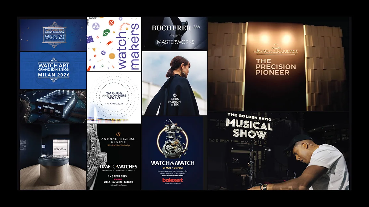
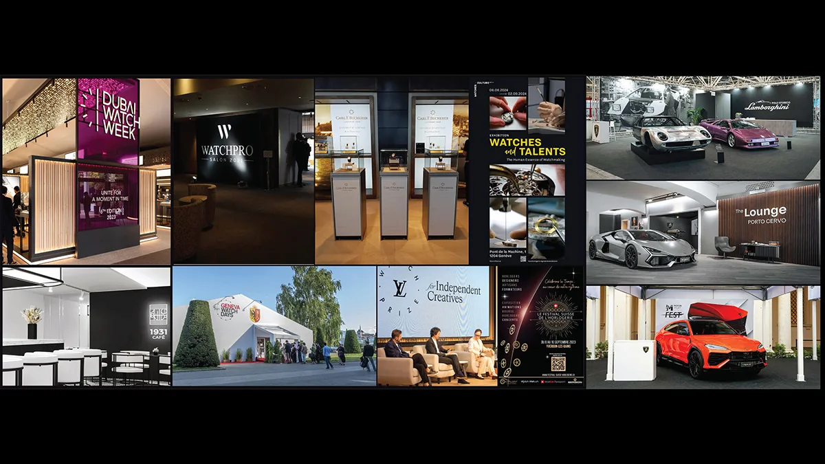
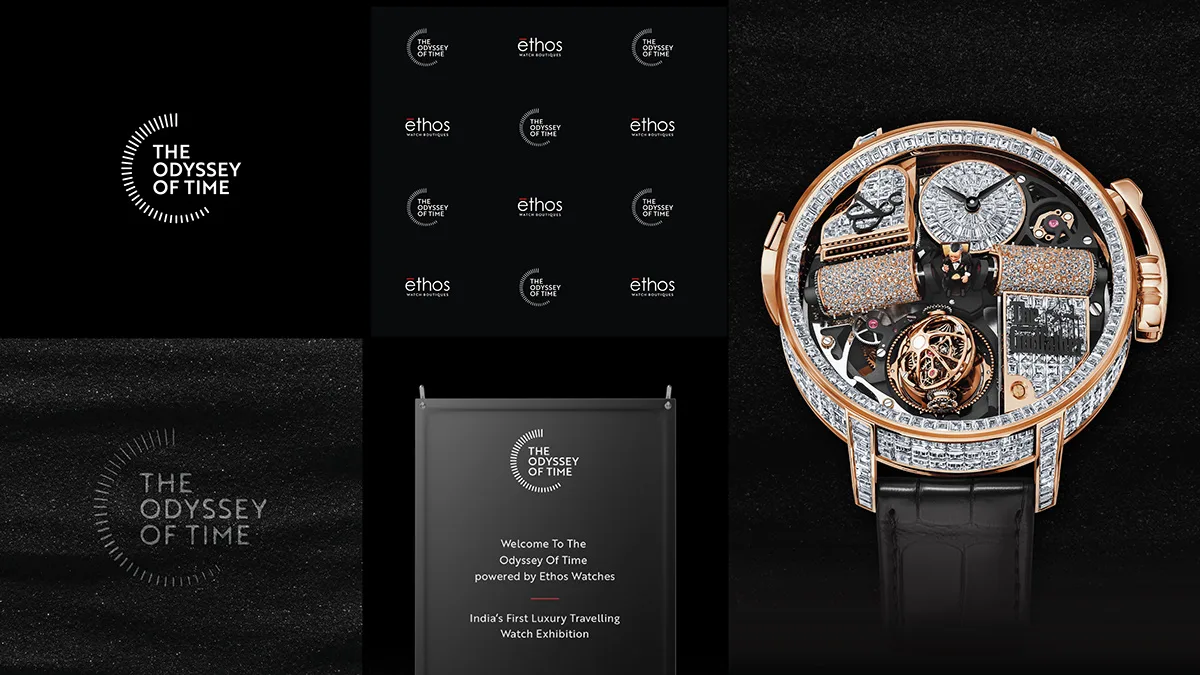
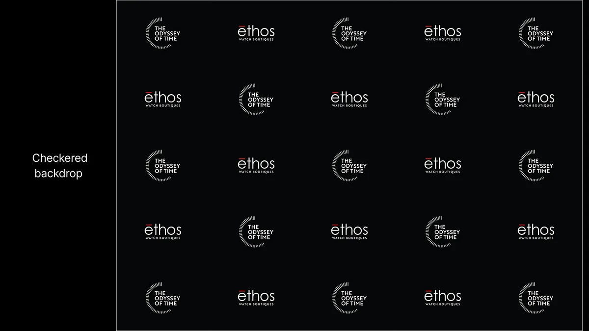
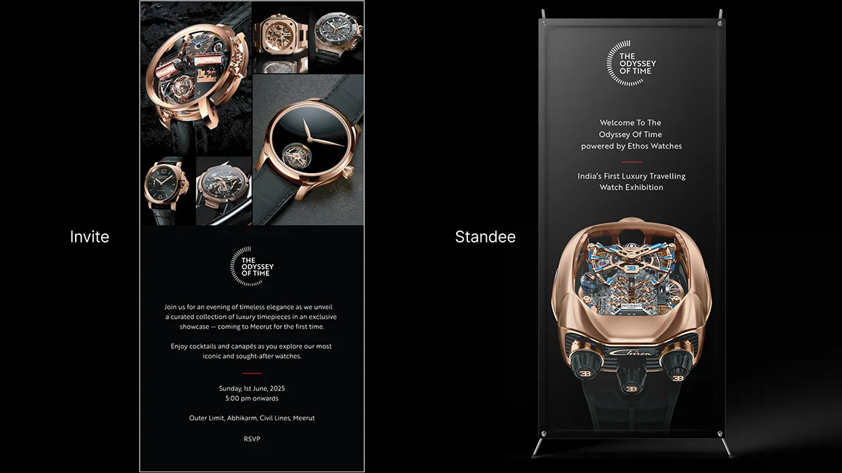
A 24-spread identity for the exhibition, mixing watch photography, event details and typography.
End of written case study for The Odyssey of Time.
Identity for a traveling exhibition of rare and technically complex watches.

Full project available on Behance
View full projectWant this kind of work for your brand?
Happy to walk through the decisions and constraints behind this project.